|
|||||
|
|
|||||
| What's been written about him; | |||||
|
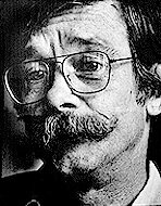
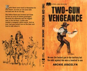
Born in East Orange, New Jersey, Gerald McConnell studied at the Art Students League with Frank Reilly and simultaneously apprenticed under Dean Cornwell. It is not easy to pinpoint an influence on his work, however, since it covers such a range of stylistic approaches and applications. Starting with Pocket Books in 1953, McConnell concentrated on Western covers for most of the major paperback publishers. When he began making assemblages in 1967, an entirely different (and better paying) group of clients became patrons. And when he won the Society of Illustrators' Hamilton King Award in 1981, it was for his ultra-rendered pencil drawing of Grand Central Terminal. A Gold Clio award was won in collaboration with photographer Cosimo Scianna on a complex construction of a mummy. Other awards include "Best in Show" of the Real Show in 1979 and numerous certificates from Art Directors Clubs. He has also exhibited his work in galleries and museums, including the U.S. Air Force Museum in Dayton, Ohio, NASA Museum and the National Parks Department in Washington. McConnell has long been a backbone of the Society of Illustrators, serving on the Executive Committee for over ten years, as house Chairman, and as Editor of the Annual Books. He is also National Vice President of the Graphic Artist Guild, and has taught at Pratt Institute. Of late, McConnell is concentrating on his publishing ventures, Madison Square Press, and Annuals Publishing Company. - The Illustrators in America 1880-1980 by Walt and Roger Reed Aside from the work he has done for most major publishing companies, advertising agencies and corporations, Mr. McConnell has exhibited In one-man and group shows In the following galleries: Greengrass, New York, N.Y. Society Of Illustrators, New York, N.Y. Fairtree, New York, N.Y. Xerox, Rochester, N.Y. General Electric, Fairfield, Ct. U.S. Air Force Museum, Dayton, Oh. Patrick Air Force Museum, Cape Canaveral, Fl. NASA Museum, Cape Canaveral, Fl. National Parks Department, Washington, D.C. Mr. McConnell has served the following: Frank Reilly School Of Art, trustee and on its board of directors Society Of Illustrators, member since 1962, on its board of directors since 1963 and executive committee since 1967. Graphic Artists Guild, founding member in 1969, On its board of directors and executive committees since then. Currently President of the Graphic Artists Guild. During 1977-78, he was a visiting professor at Pratt Institute in Brooklyn and taught a class on art law and business with Tad Crawford at Pratt-Phoenix in 1978-79. Mr. McConnell has written and illustrated a book entitled Assemblage", edited by Howard Munce and published by Van Nostrand Reinhold, on three-dimensional picture making. His awards include many Certificates of Merit from The Society of Illustrators, Art Directors Clubs of New York and New Jersey and Andy. He has received The Gold Clio Award for the "Best In Consumer Print Ad" and "Best In Show" from the "Real Show" held at Grand Central Gallery. - NASA Art Program
|
|||||
| His style in his own words; | |||||
|
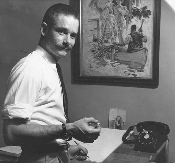
My background in traditional painting stems from study at the Art Students League under Frank Reilly. His course stressed the fundamentals - drawing and painting. During my last year of study I was on a half day schedule so I was able also to work as quasi-apprentice to Dean Cornwell. Though I had no desire to imitate Mr. Cornwell's style, observing him at work was a most beneficial experience. His approval, when it came, was a great confidence-builder. At the time I started freelancing realistic painting was the usual approach. Fortunately, because of my training, I felt at ease with my earliest assignments. Product rendering has never been my favorite form of expression. However, there is always need for this type of work and it is financially rewarding. The example I've included here was part of a campaign for Grey Advertising, which I worked on in conjunction with another New York illustrator, Howard Koslow, an expert in this area. Howard taught me a great deal about that handy tool, the airbrush. On this assignment I also did the lettering. It took me as long as the rest of the job. As in all product-rendering, the idea was to make the pack and the cigarettes look better than they would have in photography. This can be achieved with modified perspective, elimination of unnecessary detail and adjustment of color values so they will appear cleaner and slicker in reproduction. The dragon with the flower was a cover for Bell Magazine, published by A.T.& T. It was done with Designers colors and dyes. The three elements were selected by the art director to represent Red China. After gathering the reference material I made a detailed drawing of each object, establishing light and shadow patterns. I projected these onto double weight illustration board and painted the background dark, so that I could adjust all my values against it. I then painted both the dragon and the flower with dyes, which gave the brilliance I wanted. I did the final details with opaque colors. The picture containing the F4C fighter plane was done from scrap gathered in England. I was there for the Air Force to visit several British and American air bases, in order to paint the F4C in action. This particular painting was of a small 16th century church situated at the end of one of the runways near Little Stukeley. It was ironic to note that the plane was already being phased out of use while the church would probably, if not destroyed by vibration, remain indefinitely. The 40" high painting was done with opaque Designers colors. The barn door and chain, one of my Sunday attempts at therapy, was a joy to do-no art director, no client just myself to please. This was also painted with Designers colors on board. It's just a bit under life-size. All my paintings in this manner begin with numerous pencil sketches with many design adjustments. When the final solution is reached, I transfer it to illustration board by use of a Balopticon and do a very finished pencil drawing, which is then well fixed. I then cover the entire board with an overall tone which will set the color and mood of the painting. That done, I restate the larger areas with more opaque paint to the exact color and value needed, after which I proceed to the remaining areas, bringing the degree of finish up to my center of interest. - Gerald McConnell |
|
|